New York City is lauded as a pedestrian friendly metropolis— partly because people on foot can safely cross most of the 6,300 miles of streets within its borders.
One of the tools that the New York City Department of Transportation (DOT) uses to ensure that is curb extensions, which reduce crossing distances, relieve sidewalk crowding, and provide space for “street furniture” like benches or plantings.
It’s easy to take them for granted as you rush to your next appointment, but a lot goes into planning these sidewalk expansions. Before they’re built, a long list of design choices needs to be made—from where they’re placed and what they’re made of to whether they can accommodate, say, a bike-share station.
All of these specifications can be found in the Street Design Manual, a 312-page book that the DOT first published in 2009.
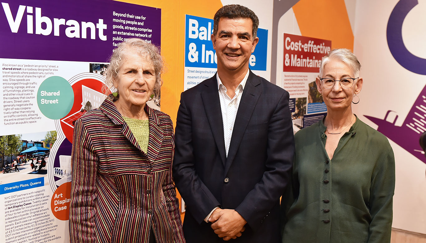
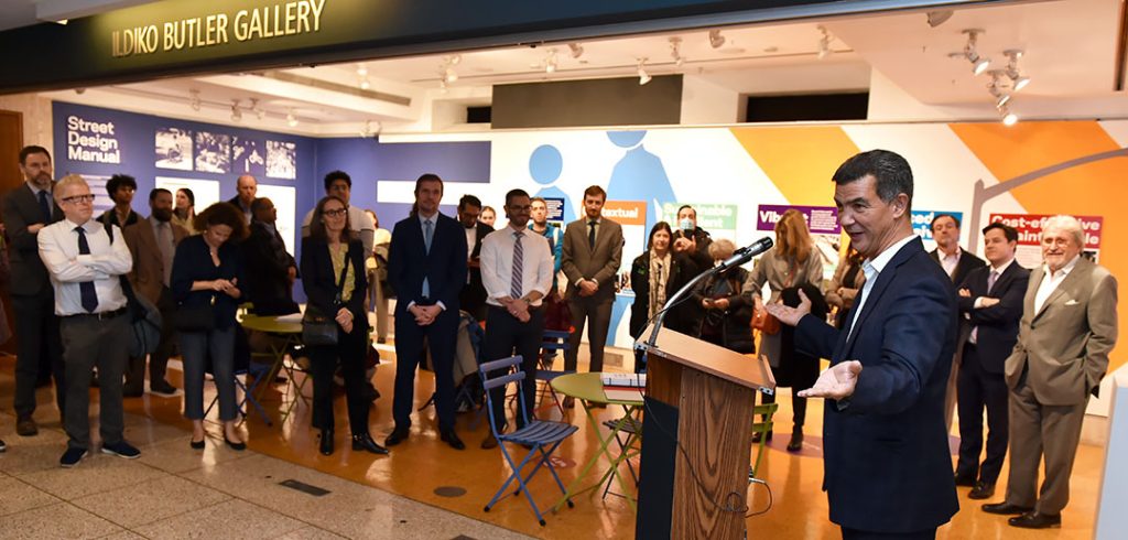
The manual, most recently updated in 2020, is the focus of an exhibit co-sponsored by the DOT and Fordham’s Department of Visual Arts and currently on display at the Lincoln Center campus’ Ildiko Butler Gallery through Feb. 2.
Abby Goldstein, exhibition curator and professor of visual arts, said the manual is key to understanding how New York City made the city safer for pedestrians, bicyclists, and anyone not driving a car. She’s seen the transformation firsthand on bike rides to Prospect Park accompanied by her friend Wendy Feuer, assistant commissioner of urban design, art, and wayfinding at the DOT. It was this friendship that spurred her to propose that Fordham and the DOT team up to create the exhibit.
“Wendy really is visionary. She’s been instrumental in the way that the city has moved to develop areas for public use that incorporate art, music, dance, theater, sitting, relaxing,” she said.
Creating a Manual That Was Both Appealing and Informative
When the manual was first introduced, it was meant to be a resource for construction managers and a guide for local leaders. But it was also meant to appeal to civic-minded New Yorkers who might want to know what goes into the design of a conventional bike lane, a protected bike lane, a two-way bike lane, or a grade-separated bike lane. This meant paying close attention to elements of graphic design to make it appealing to the average reader. Goldstein said there is precedent in this, in the Sweets Catalog System, which was devised in the 1950s by the graphic designer Ladislav Sutnar as a way to organize a seemingly endless number of industrial products.
“The design of the street manual reflects not only the care and organization and easy referencing, but it also elevates the design from just a catalog to something of beauty,” she said.
“Pure+Applied, which is the design firm that originally worked on it, did an absolutely exquisite job of coming up with a design that reflects that.”
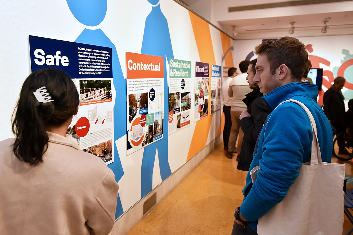
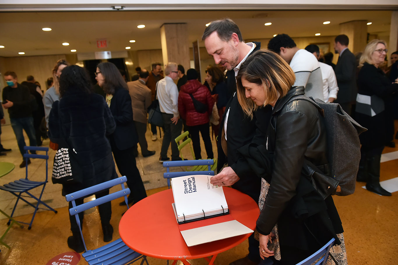
The exhibit at the Ildiko Butler Gallery focuses both on graphic design, which is showcased on mounted posters, and the end result of years of reimagining public space in New York City. Just as the streets have been redefined in recent years as spaces for more than motor vehicles, the gallery has also been reimagined as a space where one might stop and linger. There are four table-and-chair sets, complete with street manuals for perusing.
Nicholas Pettinati, deputy director of urban design at the DOT, said graphics have long allowed the agency to communicate complex design ideas to as many people as possible.
“The audience for this manual is always a big question. For the most part, we really try to make it as broad as possible, and the graphics do a lot to make that accessible,” he said.
“One of the things that we wanted to do was make sure that that the exhibit grabbed you and pulled you in. The bold colors certainly come from the manual, and the graphics on the floor, the crosswalk—these are all things that you see out in your environment. So, the hope is that it will make people curious to learn more about how this exhibit got here in the first place.”
Pettinati noted that while a lot of work that goes into any change on city streets, the manual has served as a critical place to help streamline that process to make it easier to do at a much broader scale across the city. That’s become even more important recently, as calls for equity have cast a light onto areas of the city that have not received attention.
Goldstein said that although she knew a lot about the manual from her friendship with Feuer, what impressed her most when she was working with the DOT was “the poetics of how they use language to break down the different areas.” For the exhibit, panels were created that highlighted both the goals and the design of the book. That’s something that students from fields such as art, urban studies, and political science can really benefit from.
“I originally thought, ‘OK, you’ve got concrete, you’ve got asphalt, you’ve got lamps, and you have the different elements.’” she said, adding that she soon realized there is so much more to the process.
“The fact that they highlighted in the display panels the words ‘safe, contextual, sustainable and resilient, vibrant, balanced and inclusive, cost-effective and maintainable’—you’re not going to find those in the book. Those are not the chapters. That is the thinking process that really is embedded in what they do.”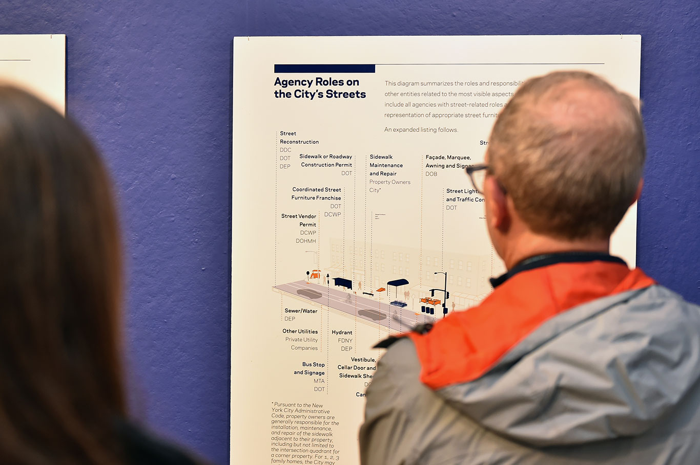
A Document That ‘Has Life’
At an opening reception for the exhibit on Nov. 28, DOT Commissioner Ydanis Rodriguez praised the manual as a document that, like the U.S. Constitution, “has life.”
“The street design manual was a vision that represented New York City when it came to the present in 2009, as well as the future,” he said.
“The first manual used photos from different cities, from different countries that we wanted to look like. In 2022, all the photos are from New York City. We reversed it in a way that other cities are now looking at how we are doing things.”
