
It’s an art form that passes under our eyes every day, coloring our perceptions of what we read, sometimes imperceptibly. Now the humble typeface—a centuries-old craft—is getting new attention because of its impact in commerce and beyond.
With digital technology making it easier than ever to design custom fonts, all kinds of organizations—schools, companies, publications, movie studios—are doing just that, seizing the opportunity to invent a distinct look and stand out among competitors who may continue to use common typefaces, said Fordham’s Abby Goldstein, clinical professor of graphic design and head of the graphic design area of study.
Goldstein is an organizer of the third annual Type Drives Commerce conference, which “developed out of a need for people in the industry and the profession to discuss this new territory, the new landscape that’s constantly changing” as more and more companies try new things with type, she said.
Setting a Mood Through Type
Taking place March 13 at Fordham, the conference will bring together creative directors, designers, and others to showcase innovative approaches to typography. Fordham students will be volunteering or networking at the event as well. It will explore the ways that fonts and typography can make a difference for any organization looking to set a tone that advances its work.
In class, she likens type to music for its ability to sway an audience emotionally. “You have typefaces that can set a mood—it can be folksy, it can be jazzy, it can be classical, it can be vibrant. So what kind of mood do you want to set and what is it for?”
She shared some examples of how fonts have been having an impact in ways we may not realize:
The right typeface brings credibility.
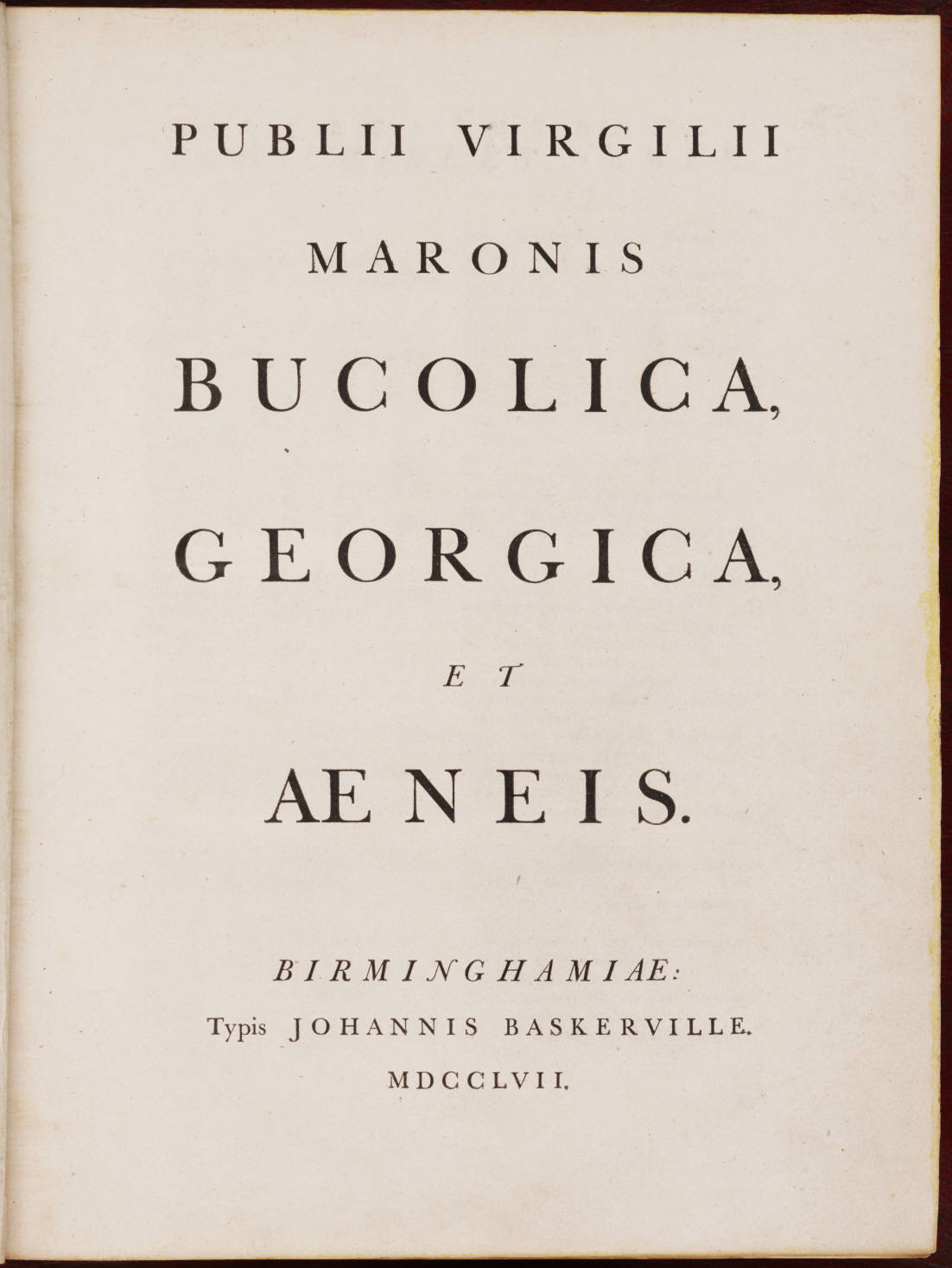
We may think of fonts as neutral, but they can affect the credibility of whatever message they’re being used to convey. Goldstein noted an informal 2012 survey written up in The New York Times by filmmaker Errol Morris, which asked readers whether it’s true that “we live in an era of unprecedented safety.” Different readers read this in different fonts, and readers were slightly more likely to rate the statement “true” if it was written in Baskerville. With its highly contrasting thick and thin lines and its sharply defined serifs, or “feet,” at the bottom of each character, Baskerville was seen by some as elegant and legible when it was introduced in 18th-century England, Goldstein said. But “some people hated it,” thinking it too modern, she said.
If you want to be believed, think twice about using this typeface.
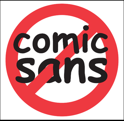
The same survey found that readers were least likely to agree with the statement when it was written in Comic Sans, invented in the 1990s by designer Vincent Connare for Microsoft programs aimed at children. He felt the font they had been using, Times New Roman, “was too stodgy for the clientele they were aiming for,” Goldstein said.
But the font has been met with “contempt and summary dismissal” when used in serious writing aimed at grownups, Morris wrote in his New York Times piece.
If you’re dyslexic or visually impaired, font choice matters.
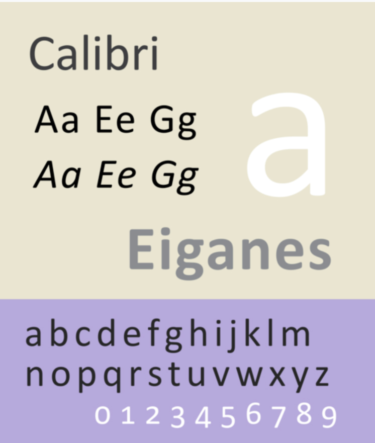
Like Comic Sans, Calibri has simple, distinctive letter shapes and wide spacing between words, which help people with dyslexia or other vision challenges comprehend the words a little more easily, Goldstein said.
“When we scan text, we don’t read letter by letter, we recognize word shape,” she said. Calibri’s distinctive lettering is also more easily identified by screen readers, which convert text into speech for those who would have trouble reading it, she said.
Helvetica helped bring clarity to the New York City subway.
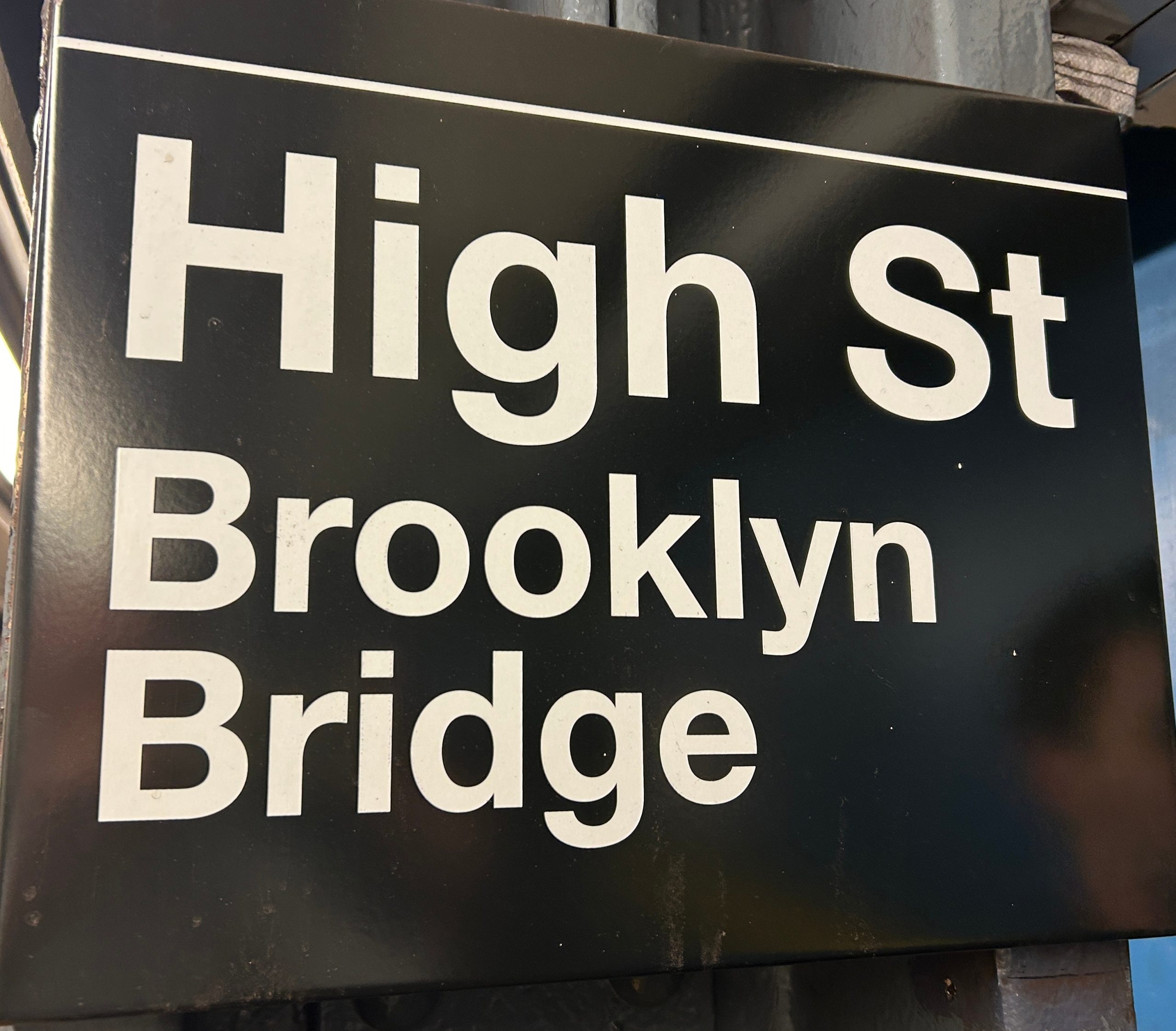
Gotham’s subway used to be a hodgepodge of bewildering signs in different formats until the city set out to create clear and orderly signage in the mid-1960s. Helvetica, designed by a Swiss type foundry in 1957, “was being marketed and was gaining traction as the most modern, flexible, and legible of typefaces,” giving a clean look that was well matched with the subway system’s rebranding, said Goldstein, who designed the book Helvetica and the New York City Subway System, by Paul Shaw.
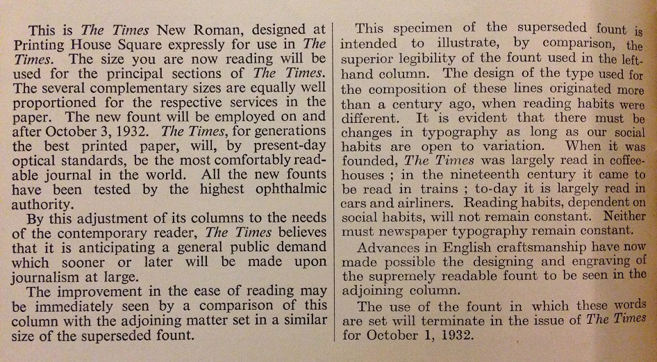
Why does everyone use Times New Roman? Familiarity.
Times New Roman was originally designed in 1932 for The Times newspaper of London, and “it was designed to hold up to the printing in large quantities on newsprint,” Goldstein said. She called it a vanilla typeface, but also a “workhorse,” that spread widely when Microsoft included it in early versions of Windows. “It’s just what people are used to,” she said.