Design by HLW contrasts old with new

Photo by Michael Falco
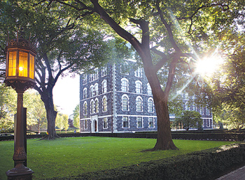
For Fordham’s newly renovated Hughes Hall, home of the Gabelli School of Business, straddling the worlds of 19th century revivalism and the digital age presented not just a stylistic challenge, but a technical one.
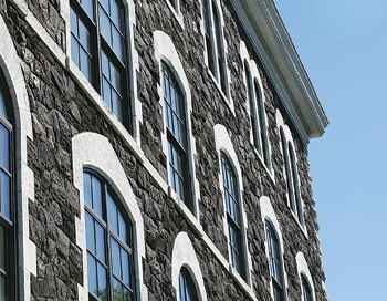
Ultimately, the $38 million renovation has allowed a contemporary interior to slip in behind the building’s French gothic façade, built in 1891.
At first glance, the renovation would almost appear to be a restoration, but a studied view reveals a surgical approach that didn’t shy away from the new. Wide marble steps lead up to sliding glass doors that swoosh open beneath a clean-lined glass canopy, where a lobby cuts straight through the building on a north-south axis. Architects used a white Vermont marble on the stairs to harmonize with original stonework, but the glass openings bring the visitors into another realm entirely.
Inside, most rooms are enclosed in glass, reflecting the current design trend in businesses to portray transparency. Stairwell landings and administrative offices provide large lounge areas to foster spontaneous collaboration.
Behind one glass wall in the lobby is the school’s pièce de résistance: a trading room featuring Bloomberg terminals and streaming stock tickers. A video wall can be programmed to track how the Student Managed Investment Fund is performing. The trading room’s glass wall holds a “smart film” that can provide privacy from the busy lobby area: just a flip of a switch transforms the wall from clear glass to digital images.

Photo by Tom Stoelker
The new building houses six meeting rooms, three conference rooms, several student lounge areas (one encircled by faculty offices), and a 160-seat lecture hall. Five of the seven classrooms seat 50 students each.
All of those classrooms include video conferencing capabilities, while some have camera-tracking systems enabling faculty to walk about the room while a camera follows them. Lectures can be streamed to remote locations in real time or edited later to include slides.
Two of the rooms hold Smart Boards with interactive screens. Faculty and students will make edits directly to the screen that will save onto a laptop.
In order to accommodate a lecture hall in the lower level that seats 160 students, the building foundation had to be lowered nearly eight feet, allowing the basement floor to be dropped three feet.
All told, the renovation has nearly quadrupled the college’s physical space.
When the renovations got underway in 2010, architects considered retaining the building’s original 19th century lean cast iron columns. But ultimately, they decided that all of the interior should go, said John Spaccarelli, Fordham’s director of facilities and special projects.
“When we were done gutting, the only thing that was remaining from the original building was the four masonry walls,” said Spaccarelli. “Nothing else was left, not even a nail.”
A gut renovation was no small decision from both an engineering standpoint and theoretical standpoint, said architect Jennifer Brayer, a partner at HLW, the firm charged with overseeing the renovations. But after several planning sessions with Joseph M. McShane, S.J., president of Fordham, and Donna Rapaccioli, Ph.D., dean of the Gabelli School of Business, all involved decided to clearly demarcate past from present.
“It’s all about the juxtaposition of materials,” said Brayer. “There’s a purity in distinguishing what is old and what is new, and then celebrating that.”
If deciding to draw the line between past and present proved a challenge, engineering it was a feat. The major task—dropping the entire foundation eight feet—required workers to excavate beneath the original stone walls, one 40-inch section at a time. As the digging proceeded, the area was shored up with lumber to keep the soil from collapsing in. Once completed, the pit was pumped with concrete.
The old materials were carted off with an eye toward staying green. “Every piece of material that left this site was recycled,” said Spaccarelli. A full 65 percent of the new construction is also fabricated from recycled materials.
With the new foundation in place, footings and 75-foot I-beam columns followed, which took on the role of supporting the new structure, relieving the 122-year-old stone façade of its primary duty. Next, crossbeams had to be brought in through windows to span the building’s 50-foot width. After the old floors were removed, crossbeams were raised back up to the original floor height, so that the windows would once again fall into the original placement between the floor and ceiling.
Perhaps the building’s boldest gesture is a green glass replacement for the old copper roof. Following the original mansard in form, if not function, the glass both provides windows for faculty offices and continues up past the interior so as to hide rooftop equipment. The composition gives the roof a pavilion quality from the outside; inside, angled glass windows make some faculty offices feel like Parisian garrets.
“We wanted to respect the past, but again there was a desire not to mimic it,” said Brayer, adding that she credits Father McShane and Dean Rapaccioli for taking a chance on a distinct gesture that points to the future.
